Global architecture, design and planning firm HLW has unveiled the design for Capital One’s Nottingham Office at Trent House. The 180,000-square-foot space supports an agile working environment that honors a continued design language between its London headquarters.
Following the completion of Capital One’s London headquarters, HLW was engaged to complete the workplace strategy for their large-scale office in Nottingham. Capital One tasked HLW to design their new office with a goal to support their evolving business, creating a flexible space that is easily adaptable to accommodate future developments in their company. The resulting design improves variety, adjacencies, flexibility and connectivity across the building and floor plates to better support their staff, and to bring the Nottingham workspace in line with the newly designed London HQ.
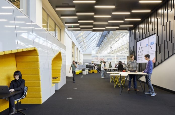
The concept was inspired by Nottingham’s history of trade, which predominantly consisted of lace making factories. Keeping the building’s character while infusing it with modern amenities, the design team combined texture with strong geometric lines and bold colours against a continuous background to define neighbourhood areas throughout. The team used clever design features to refresh the space rather than needing to utilise a high budget to make costly changes.
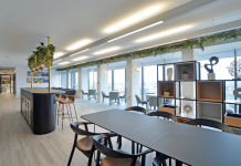
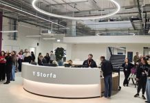
A new hub of activity, various focal points have formed destinations that provide different functions in each, encouraging employees to move away from their desks, therefore giving way to chance encounters and interaction. The hubs were strategically planned to break up the floor plan and encourage use. Their multifunctional design offers opportunities for breakout and collaboration space, tea points for refreshments, as well as designated quiet areas for heads down work. To break up the space further and create an inspiring journey, the design team divided the neighbourhoods into organic regions with informal collaboration areas to support teams. The entrance was also reinvigorated — the design team activated the entry corridor by adding functional spaces that allow the areas to be used as a promotion space. The design team extruded the main wall and created hollow elements, which make up meeting settings.
Additionally, flexibility and functionality were two important factors that needed to be incorporated into the workspace, as Capital One employees require a variety of choices to match their working styles. Moveable whiteboards, integrated technology, a range of working areas and a mixture of low and high tech features combine to accomplish this and support the exciting work they do.
The refreshed office supports over 1,000 employees with its inclusive and modern working environment driven by rigorous research and an effective and intensive workplace strategy.

