London-based consultancy Run For The Hills is delighted to finally unveil its design for TIVOLI Cinema, a new breed of boutique cinema which opened for the first time in Bath this week. The studio has created not only the brand’s visual identity but has also designed the interior of this first debut location, which showcases not only TIVOLI’S exciting and stylish screening rooms but also TIVOLI’s high-end social and dining spaces, which are a destination in their own right.
Brand Identity
Run For The Hills worked very closely with the cinema to conceptualise and create the new brand’s signature visual identity and the launch marketing campaign for this inaugural location. TIVOLI’s characterful tone of voice is echoed across the cinema’s advertising campaign, menus, and signage.
The new logo is a bold, sans serif logotype that oozes confidence. It has a creative leaning while remaining luxurious, trustworthy and exuding gravitas and features a mysterious logomark that hints that TIVOLI holds the ‘key’ to unlocking the infinite visual senses.
A number of TIVOLI patterns derived from the logo are used on tickets, coasters, popcorn buckets, coffee cups, and other in-venue packaging. TIVOLI’s core palette is cream and deep charcoal grey, which creates a classy more-than-monochrome look. This has been paired with red, teal and purple as secondary colours. Gold is added where an ultra-luxurious touch is needed.
Our branding team also crafted the ‘Cinema, Re-classified’ marketing campaign, and the animated ident graphics that appear on screens around the venue, including the big ones.
Justin Ribbons, CEO, TIVOLI Cinemas, said: “We chose Run For The Hills because we’d seen their standout bar and restaurant design work and wanted a specialist hospitality design partner to help make TIVOLI a destination in its own right, that also happens to be a boutique cinema. We also like the fact they do both branding and interiors, so we got to work with just one design shop to create a seamless, new brand identity and in-venue look, from the decorative scheme to the design of the menu, signage and ad campaign.”
Interior Design
The overall design of the main hospitality space on the first floor is laid-back luxe. The core colour palette is rich golds, ochres, olive greens and dusky blue tones in slouchy linens, brassy velvets and deeply textured weaves.
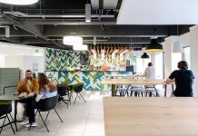
The venue is dotted with comfy sofas, deep armchairs, decorative rugs, warm wooden chairs and upholstered stools in contrasting textures and patterns. The layout is designed to create natural zones between the bar, café-lounge area and more formal dining areas. Flooring and tiles are kept monochromatic, ranging from stone-hued neutrals to black and white stripes, letting the upholstery and soft furnishings add colour and patterns.
Hospitality Space
The Bath venue has four, fifty-seat screening studios and a twelve-seat Directors Lounge/Screen bookable upon request, offering an exclusive cinematic and dining experience in a premium environment. The first thing which greets people on the first floor is a beautiful hero cocktail bar where six glamorous stools in a mix of antique brass, blackened steel and dark tropical patterned velvet run alongside the 9m long arabescatto marble topped bar with heavy antique brass bullnose edging and a softly lit mesh front.
The exposed bar storage is crafted from a mix of rich toned timber, antique mirror and blackened metal and brass joinery. Floor-to-ceiling pillars decorated with crackle-glazed artisan tiles and contrasting paintwork are dotted throughout the space. The columns directly by the bar are wrapped by circular drinks tables and upholstered bar stools.
Beyond the bar is a beautiful, inviting and relaxed café-bar and lounge area. Seating and tables within the lounge include an eclectic mix of leather, wood and upholstered dining chairs and chunky tables in wood, antique brass, marble and zinc. The intimate, curved shaped sofa is perfect for romantic couples.
At the far end of the space is a more formal restaurant area, the entrance is framed by curved urban-deco crittal screens that divide the space without closing it off completely. Behind the screens are full height drapes, allowing for more intimate private dining and events, giving maximum flexibility for either private or public use.
Screening Rooms
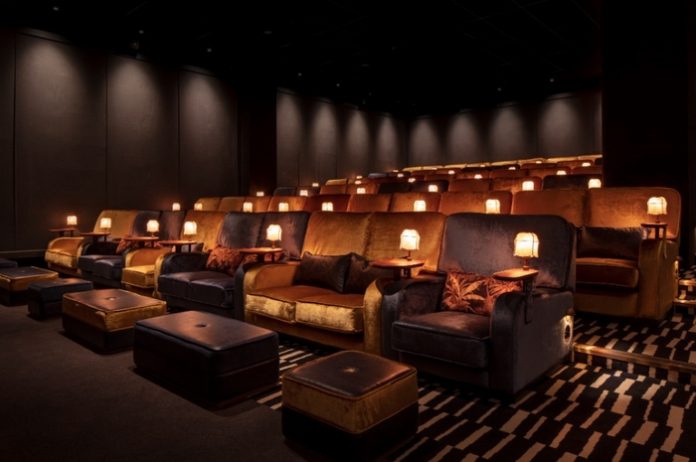
The four screening studios are glamourous boutique-sized cinema auditoria that use a palette of midnight blue and gold.
Decorative trims and border details frame bold painted walls, creating a powerful backdrop to the relaxing atmosphere. Fabrics and soft furnishings feature block colours, bold geometric patterns and pastels with pops of bright colours with contrasting piping and trims.
The velvet-clad, sink-into, two-man and single sofas are paired with decorative cushions for extra comfort. Each sofa has handy shelves on the back for personal effects and is matched with a table for in-screen drinks and dining. The sofas on the front row are paired with velvet and leather footstools.
The inky-blue fabric-draped walls are lit with soft washes of light and low-level bespoke table lamps add to the gentle ambiance. For the floor, Run For The Hills designed a carpet that features a pattern derived from TIVOLI’s logo.
Director’s Lounge
The cosy, exclusive twelve-seater Director’s Lounge is sleek and sophisticated. The room has its own dedicated foyer and entrance with a private adjoining hospitality lounge featuring high-end leather sofas and an in-screen honesty bar. Dark leather seating, geometric wall-fabric and upholstered wood panels are used throughout.
Dark tropical print cushions add an unexpected flair. The room is filled with custom joinery and brass accents and each of the two-seater sofas is paired with a footstool ensuring the ultimate cinematic experience.
Creative Director, Anna Burles, of Run For The Hills, says: “This is our first foray into cinema design and we’ve absolutely loved it. Tivoli is a bold, charismatic new concept and our interior styling marries seamlessly with TIVOLI’s branding, also designed by our graphics studio. The overall look and feel of our interior scheme is laid-back luxe, super stylish but very welcoming and ultra comfortable. Our client really enjoys the design process and it has been a privilege developing the concept with him and we are so proud to show it off now that it’s open.”


