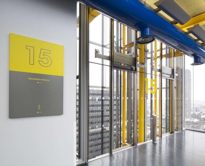
The iconic 240,000 sq ft 88 Wood Street building designed by Rogers Stirk Harbour and Partners in the City of London has been treated to a new brand, by creative agency, Graphicks, which has been used to create the building signage both internally and externally.
Newly installed property asset manager Knight Frank inherited a disparate brand with huge inconsistencies of application throughout the building with a mix of styles and fonts across external signage, tenant boards, reception desk and wayfinding; there was no single style that was more prevalent than others.
Graphicks were engaged to produce a refreshed brand for the building which could be used consistently throughout on signage as well as stationery, the tenant web portal and staff uniforms.
The project was kick-started with a thorough sign survey and researching the history of the building: The office wings are constructed of in-situ concrete, contrasting with the lightweight, steel-framed service towers. The use of brilliant colour enhances their impact – air intakes and extracts at street level are also brightly coloured, contrasting with the neutrality of the occupied floors. The façades of the main office floors are glazed from floor to ceiling to maximise daylight and views
The colour palette and construction of the building formed the basis of all the new brand looks produced at first stage. Five proposals were whittled down to three and eventually to one.
The result, a cohesive brand with greater clarity, consistent font and colour scheme throughout the building and on all building communications materials be they physical or digital. Creating a more impressive work environment, by enhancing the building image and being the stimulus for the new building community that is evolving on site.
Commenting on the rebrand, Knight Frank property asset management Partner, Will Monk said;
“It is important that 88 Wood Street retains its established values but at the same time develops a new and modern identity with an adaptable style. The rebranding exercise ensures that we get the correct and consistent message out there. We are delighted with the outcome, which has been enthusiastically received by both our occupiers and on-site staff. Will Hicks and the graphicks team have been able to meet the precise demands of a rebrand for a building of significant architectural merit.”
Will Hicks, MD of Graphicks commented;
“This is an exciting time for graphicks as we continue to work on major branding projects in the commercial property sector. We worked closely with Knight Frank to develop a brand identity that represents the characteristics of the building itself. 88 Wood Street is about, ultra-clear, frameless glazing in its many façades and we have a brand which embraces this. The rebrand represents our ambition to create a clear and concise design which works across all the internal signage and communications, and ultimately creates a better work environment for the thousands of workers who enter the building daily.”


